How can many different indicators become a readable picture without losing their differences?
Put the signals in the same room
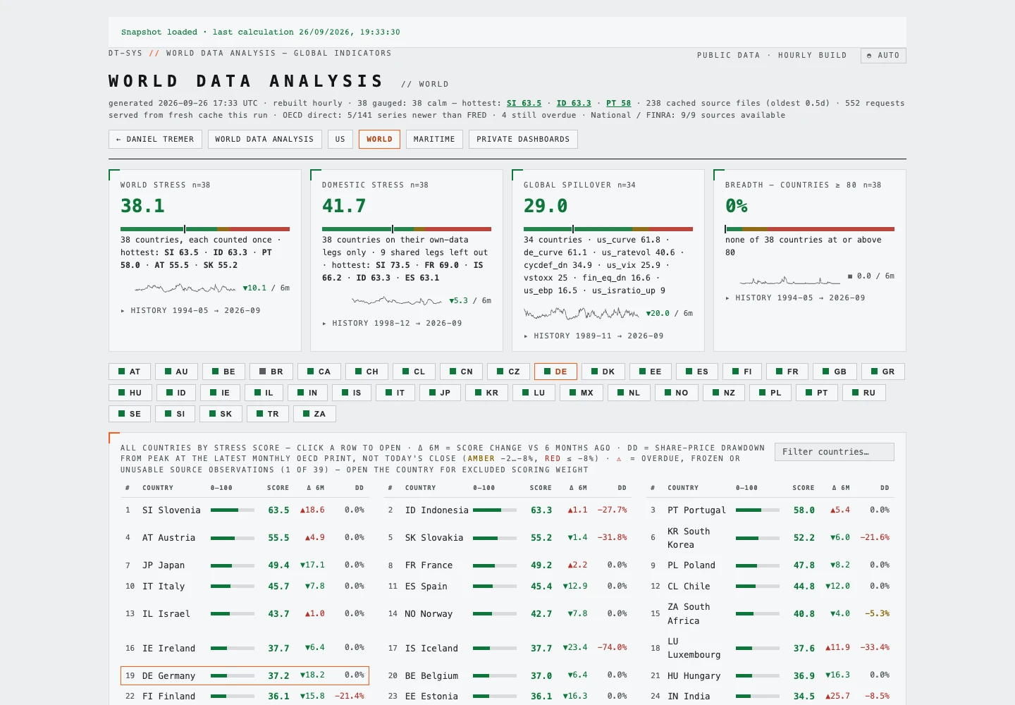
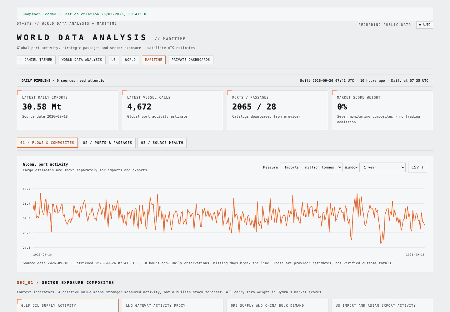
The US Indicators Dashboard gathers a broad collection of economic and market observations in one public view. Its summaries separate cycle conditions, near-term stress and longer-horizon valuation, while the indicator sections expose the detail beneath those summaries.
That separation is the central idea: a valuation measure and a short-term stress indicator answer different questions. Placing them together should make those differences easier to see.
Read below the headline number
The interface includes explanatory controls, composite coverage and breakdowns, and counts of green, yellow and red indicators that can be used as filters. Detailed sections cover areas such as credit, rates, volatility, commodities and market breadth.
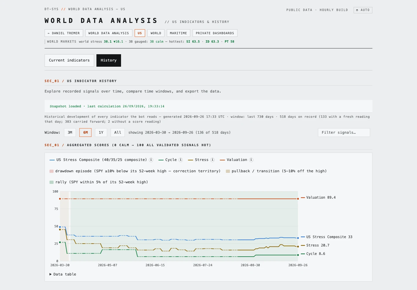
The dashboard also shows a calculation timestamp and links into historical views. These help distinguish the date the page was assembled from the reference dates of the observations it contains.
Compare views, not just colours
Start with the overview, inspect a summary’s components, and open History to see how the readings evolved. Colours and composite scores organise the available evidence; they are not precise forecasts or instructions to trade. The linked public dashboard provides the interactive version behind this screenshot.