How do local conditions and shared global pressures show up side by side?
Start with the world, then choose a country
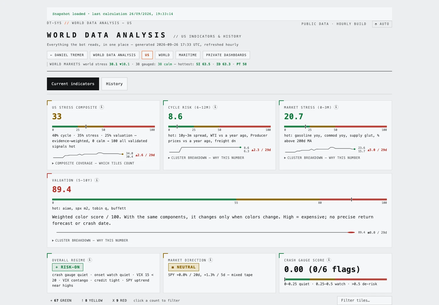
The World Dashboard brings country-level economic and market observations into one public interface. The overview summarises global stress, domestic conditions, shared pressures and the breadth of elevated scores. A searchable country ranking makes it easy to move from the broad picture to an individual place.
The curiosity behind it is comparative: a movement that looks significant on its own may read differently alongside other countries, or against that country’s own history.
Keep the context close
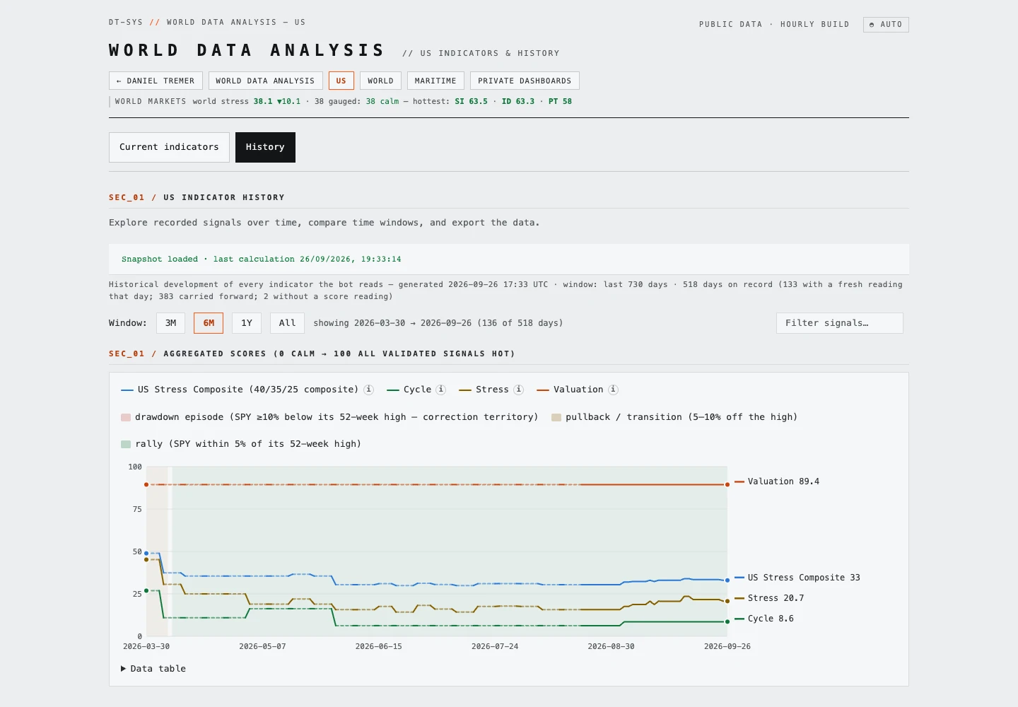
Selecting a country reveals national observations, the indicators used in its score, and a historical view of scores and share-price drawdowns. Other observations appear separately as context, so being visible on the page does not automatically mean contributing to the score.
Source labels, reference dates and freshness notes help explain what the display is actually comparing. An hourly page refresh does not make a monthly economic release a new observation.
Explore a pattern, then inspect it
Use the country selector or ranking to explore a place, then follow the individual indicators and history. The dashboard describes observed conditions and reconstructed historical context; its scores are not a forecast of the next market move. The public interface is available directly through the link on this page.